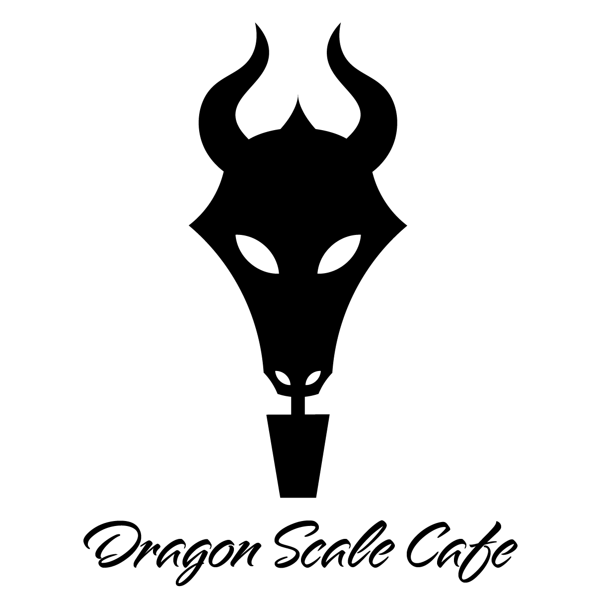
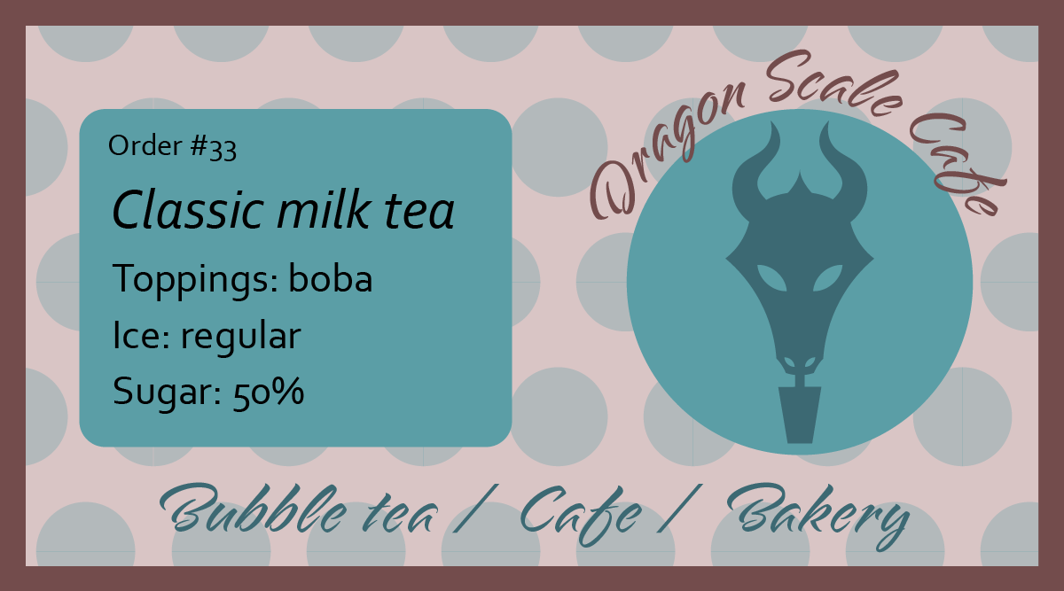
I really love how this project turned out. I had some trouble with the logo looking like a bull, because of the horns and snout. After changing some things like adding a spike and curving the horns, I think it looks better. I created it using the shape builder tool and curvature tool for the horns, then the pathfinder join option. I cut out the eyes and nostrils with the pathfinder subtract option. I used the type on path tool for the name on the label. The font is Alpine Script. The order deatails are made with Corbel font. The purpose of the label is to stick it on a plastic cup, so the barista knows what to make.